XBMC on AppleTV – Beautiful User Interface
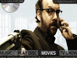
As I continue to test, play and poke around the enormous amount of resources that exist for XBMC (Xbox Media Center) on AppleTV, I felt obliged to comment on just how stunning the visuals are. I briefly mentioned the user interface in my last post, but this is the type of appearance that can only be expressed with pictures.
From an HTPC background, the closest memory I have to ever being as impressed with a user interface was with the old Meedio, which had some similar awe-inspiring user interfaces. Keep in mind, the following have all been designed by the community–proving just how important having a loyal following can be. These skins are not that easy to implement properly, as you have to source and install the skin and all the wallpapers used. But again, with the resources from the XBMC forums, I had little problems figuring out how to SFTP into the AppleTV and then uploading. Still nowhere near the simplicity of other HTPC software like Boxee or Media Center, but they don’t look like this either.
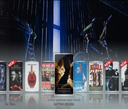
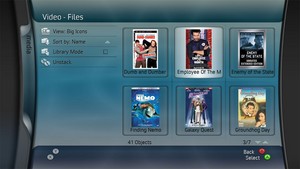
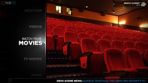
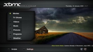
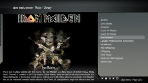
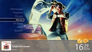
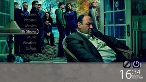
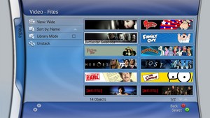
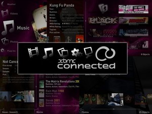
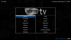
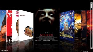
Here’s some images from the multitude of skins that I was able to find
on the XBMC forums (try to pay as much attention to the menu items and
cover flows as to the wallpapers which are strictly images):
|
|
 |
|
 |
 |
 |
 |
 |
 |
 |
 |
 |
 |
 |
 |
 |
 |
My favorite is the Aeon skin–the top two thumbs above. So, if you
have seen this in person, or if this is your first time
viewing…what’s YOUR FAVORITE? I tried to keep the skin name in the
images above so you can see the name from those.

