SageTV: Which interface is for you? A review of the choices

I hope you enjoy this writing. I had submitted this just the day before the news that SageTV was coming back to be open sourced from the founder Jeff Kardatzke. Who would have seen this coming? Not me, not our Editor in Chief Mike Garcen; really no one. Sage has stood the test of time. With many beginning to walk away from it including developers, and a few things breaking from time to time, as of lately, it seemed that SageTV was on it’s last legs and would fade away. It’s been no secret to anyone reading Missingremote, that I am a big SageTV fan. Wouldn’t you know after I write that this would most likely be my last SageTV article, that SageTV makes the announcement that it makes this week. I’m glad I was wrong.
I am leaving my writing as is with a few added remarks from myself along the way. This for entertainment purposes as well informative. I hope you enjoy the nostalgia and smirk as much as did when reading it again.
With not much heard from at the SageTV camp anymore (until now) and without further development, unless something changes with SageTV, (Changes will be huge as it is becoming open sourced soon) this will most likely be my last article regarding SageTV.(eeh, not anymore) This writing is about the different interfaces of SageTV, particularly Version 7 regarding comparison. I think it’s important to mention that I think it’s awesome that all of these developers put in all of the time that they have to help make all of the SageTV users experience over the years that much better, so THANK YOU! That being said, I am not a software writer as I have written many times before and I cannot do what you do and may not fully understand all of what is involved with making things work when writing code. My observations are from a user point of view, so some of my observations of your work may seem a bit critical; I mean no offense, with highest respect, again thank you for all of your hard work! Below are my observations with the various different UI for SageTV.
SageTV offers so many features and flexibility, it seems that the Achilles heal for them has always seemed to have a lacking with the primary interface both in usability and aesthetic appeal. Due to the lack of appeal in these areas, it has caused many in the community to create alternative interfaces. These interface reviews will focus mainly on the version 7 interfaces with a dabble into version 6 directed to SageMC that was so popular it was made available to be used in version 7. The reviews of the interfaces are not meant to cover every possible feature or scenario, but it is more less an overview based on my experiences of using all of them for a period of time.
SAGE BASIC INTERFACE VERSION 7:
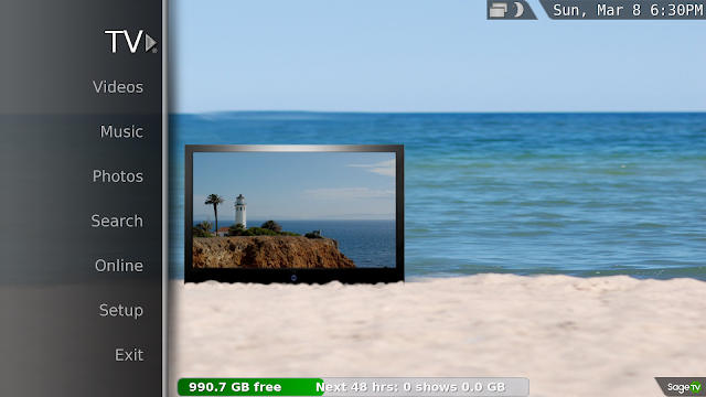
The SageTV interface that comes as is packaged has a lot of phenomenal features and the ones it doesn’t have you can make active in the “hidden extras” by going into the system information and entering in the #’s “5309” or by downloading a plugin for a particular feature that you would like. The flexibility of the user interface is great. The visual aspect and some of the functionality is less to be desired. While an improvement visually compared to version 6, it is still not the improvement needed to push it above the competition of WMC among others.
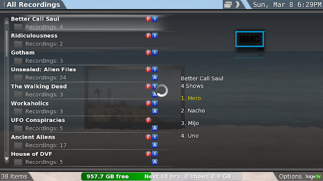
The small fanart, menu search that isn’t as intuitive like pressing a button to go to “F” but only going to “D” and not being able to direct folders to a particular category such as “movies” or to customize folders to have this done was a lack of vision. In fairness, SageTV version 7 was in it’s infancy when Google bought them out. Below are some pro’s and con.
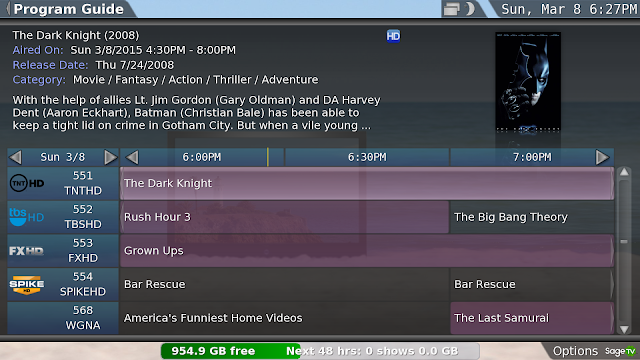
PROS:
- Runs very smooth with extenders
- Doesn’t use a lot of Java resources
- Very flexible, dependable and plugins work as intended
CONS:
- Small fan art
- Not as attractive
- Menus not as intuitive
- Can’t direct or customize folders to a specific category
- All title menu can’t be grouped or filtered
DIAMOND LEGACY INTERFACE PLUGIN:
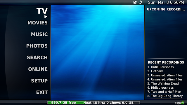
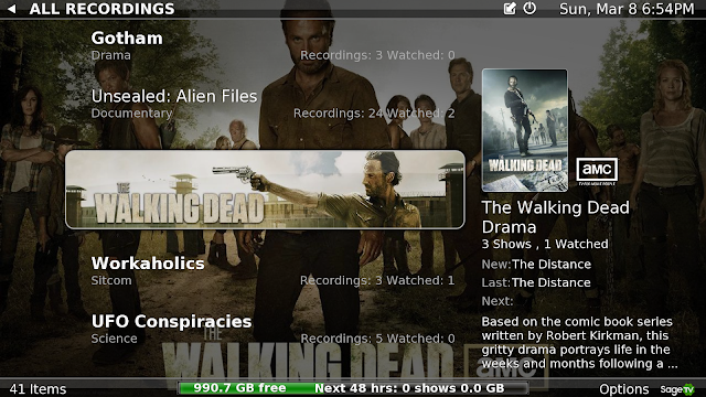
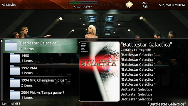
The Diamond Legacy interface is a plugin that is downloadable to go over and meld into the original SageTV version 7 interface. Much of the interface works the same way that the SageTV basic interface works however is customizable that allows you to make your own category and direct any folder into that category as well as being much more search intuitive by hitting the # 4 button twice to search “E” alphabetically as an example. It also features full screen fanart and gives the interface a very attractive look. It says that it should only be used” for users that have upgraded to Gemstone and wish to return to Diamond… as unlikely as that may be!!!!” O-K…. I can give you two reasons, the weather app and complexity, but I’ll get into that when I get into Gemstone.
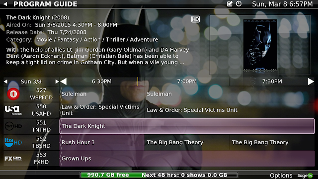
That being said it seems like problem solved right? Just download diamond and all problems solved. Uh, not quite. If only life were that simple. Some problems that I have had with Diamond is that it turns off some plugins, sticks with extenders too much, has locked up SageTV on occasion and uses a lot of resources for Java, sometimes coming very close to maxing out the Java memory which has shown in performance issues that has even caused recordings to fail. If you don’t have a lot of extenders, this may still be your ticket, however you cannot use it for the HD 100, it just simply does not have the horse power to run Diamond or Gemstone.
PROS:
- Visually Attractive with many themes to choose from.
- Allows the SageTV UI features to carry over.
- Works well with most plugins.
- Very attractive and customizable.
- Brings some features of SageMC.
- Big fan art.
- Customizable for categories and to direct folders to them.
- Folders can be grouped, filtered with a simplistic usability.
CONS:
- Sluggish with extenders and cannot be used with HD 100 very successfully.
- Data not always accurate regarding imported files.
- Doesn’t always include all of your imported files for one reason or another.
- Uses a lot of Java resources and not recommended for households using many extenders.
- Can have reliability issues.
- No further development.
GEMSTONE:
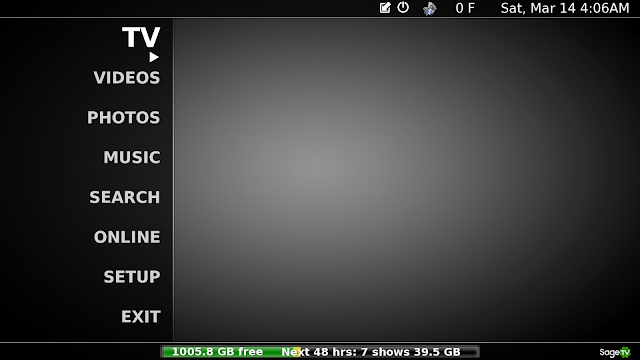
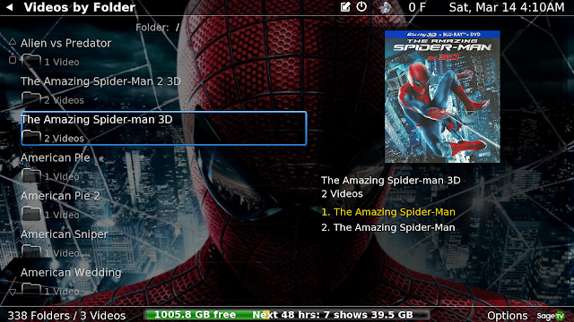
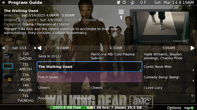
Gemstone is basically the next version of Diamond. It is even more attractive than Diamond with more options to choose from. You can customize even more, including the backgrounds but I find the level of customization to be a bit of a hindrance, especially when it comes out of the box with a greyish black background. Gemstone is a good example of where less is more in my opinion.
Also changed was the weather option that moved away from the very popular regular UI SageTV 7 weather interface that had weather radar. Why?????!!!!!!. This made absolutely no sense to me and really irked me. I live in Florida and we seem to be always be dodging something in the weather, so when the weather looks disturbing outside, I like to quickly check SageTV weather radar and see if its heading my way or not. Why Gemstone was written differently that excluded this is a mystery to all. What was presented was not better so why change it? While there are more interfaces to choose from and the automatic implementation of a version ADM (a customizable menu plugin), it didn’t resolve some key issues plaguing Diamond. These would be Java resources, and usability with extenders still being an issue and it cannot be used with the HD100.
PROS:
- Has almost everything that Diamond has.
- Very attractive user interface and folder structure is even more customizable than Diamond.
- Comes with a fully customizable menu tool.
- Background Menus fully customizable which can be saved and transferred to any extender.
CONS:
- While a little smoother than Diamond, still sluggish with extenders and cannot be used with the HD 100 very successfully.
- Uses more Java resources than Diamond and not recommended for households using many extenders.
- Different weather app that doesn’t give weather radar.
- The customizable menu hides some of the UI that would normally be seen in the basic UI or in Diamond.
- Some plugins don’t work well or become disabled with Gemstone.
The next set of interfaces are complete replacements of the Basic SageTV UI interface and are unique in themselves.
PHOENIX:
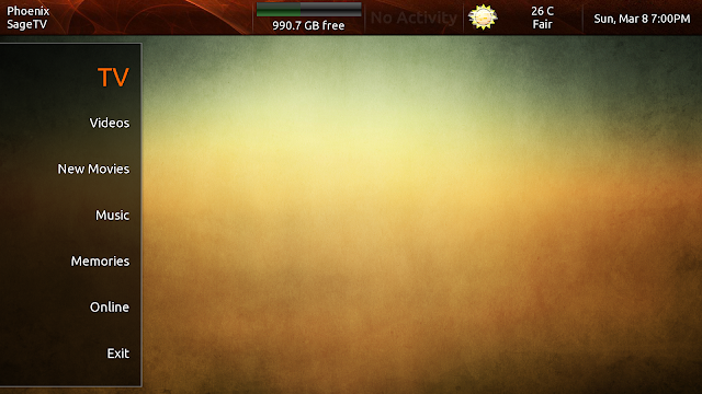
The Phoenix UI was meant to be the successor of the very popular SageMC that was used with version 6, however the developers of Phoenix have opted to have a complete different UI instead of rewriting a version of SageMC. Phoenix uses full fanart, is a very modern and attractive looking UI and gives you several interfaces to choose from. It gives way too many options in my opinion when trying to do a simple change and the weather app is currently out of date.
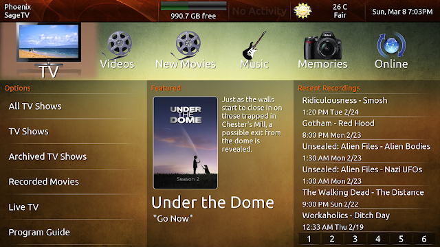
Phoenix does not use a lot of Java resources when using extenders as does Diamond and Gemstone. It is also very responsive and smooth, intuitive with menu searches and can work with any extender including the HD100. The animations are very smooth as well and have a nice fade in. While the menus can be customizable, there is too much of the same thing I think and does not offer the option to block deleting of imported files like every other UI offers. This can be very dangerous, especially in the recorded TV area, because if you have say “5 Seasons of Modern Family” on DVD and you have been recording Season 6 it will show all say 19 videos as shows and if you would like to delete all of Season 6, it doesn’t recognize the difference and will delete the imported media too. To me that is crazy not to have a fail-safe to prevent that. This is one of the reasons why I am not using Phoenix. All it takes is one mistake and when you have kids….. The other is when customizing the menu, it sometimes for one reason or another doesn’t take, after that, you get “error messages” that will show up until the end of time no matter what interface you use, even after removing Phoenix. I don’t know a way to fix it without removing SageTV and installing into a different directory. Installed plugin extras generally do not transfer to Phoenix unless using Comskip and Playon that I am aware of.

PROS:
- Visually attractive and modern with many Phoenix interfaces to choose from.
- Big fanart
- Customizable interfaces
- Folders can be grouped with basic organization.
- Has a just added option so you don’t have to search forever to find what was just added.
CONS:
- No preventable deleting option
- Weather app is out of date.
- Customizations don’t always stick.
- Cannot specify folder categories as you can in Diamond and Gemstone.
- Too many options when trying to make a simple change.
- No options for additional plugins.
- Can’t do Movie Trailers as you can in SageTV 7 UI and upcoming movies are not organized.
- Includes imported TV DVD’s in recorded TV which can risk accidental deletion of imported files.
PHOENIX 2:
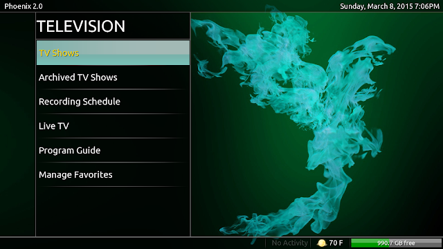
Phoenix 2 is a more simplified version of the original Phoenix with the updated weather app. Our own Daniel Schoerner wrote a great article regarding Phoenix 2 which can be viewed here. Not to take away from anything Daniel has written, when comparing UI’s for this article to expand from what was already been written, it is very attractive, however only has two UI options compared to the several that are offered with Phoenix. It also runs just a little smoother than Phoenix and I would have to say is as responsive as the original UI of SageTV 7 in my experience with it.
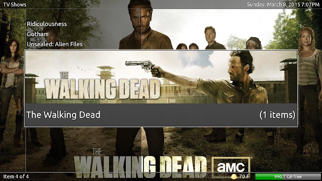
It still has the same nuances as Phoenix in that some of the customizations do not save the changes and in the some cases will cause that irritating error message forever that cannot be fixed. I do like the fact that it is simpler in regards to user options, and deleting saved files is better hidden however you cannot prevent deleting files which is a bit scary for me. Phoenix 2 uses little Java resources and you can use several extenders with it without problems. A bit of a surprise is that closed caption does not work with Phoenix 2 as it does in Phoenix. This is a biggie. While I don’t use it much, when my parents come over and my mom who has trouble hearing the dialogue sometimes, needs closed caption.(It seems she still never has trouble hearing when I do something wrong though)
PROS:
- Visually attractive and modern looking.
- Big Fanart.
- Simpler UI
- Folders can be grouped with basic organization.
- Has a just added option so you don’t have to search forever to find what was just added
- Weather app has been updated.
- Improved file deletion avoidance by not making it an immediate option on saved files.
CONS:
- No preventable deleting option
- Not as many UI customizations if that is your deal.
- Customizations don’t always stick.
- Cannot specify folder categories as you can in Diamond and Gemstone.
- No options for additional plugins.
- Can’t do Movie Trailers as you can in SageTV 7 UI and upcoming movies are not organized.
- Includes imported TV DVD’s in recorded TV which can risk accidental deletion of imported files.
- No closed caption.
SAGEMC:
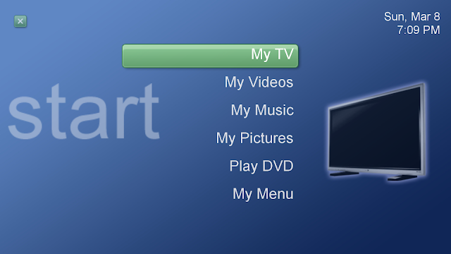
So why write about SageMC for an article that is primarily based on the SageTV version 7 UI options you ask? Because despite all of the advances that SageTV 7 brought, it is still a very popular UI that is still used today by many that won’t convert to version 7 because of the WAF and friendly UI that it is. There has been plenty written about SageMC in the past and I definitely don’t plan on covering that in this article. To sum up SageMC, it was meant to give a more familiar and user friendly UI for both SageTV and WMC users that would prefer to use SageTV but still has that familiarity of WMC. Now this is not a copy of WMC, it is fully customizable and is like WMC on steroids. You can view all of the features on SageTV’s website or the many other published articles out there. It was so popular that it was made to be a downloadable plugin for SageTV 7. That being said, it is not running off of the SageTV 7 platform and is still running off of version 6 so to speak.
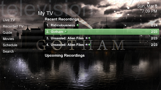
The animations and background fanart are based off of the 6 platform and are noticeable in the fades. It also does not run as smooth as version 7 and you tend to get that spinning wheel more. It is extender friendly and does not have Java issues regarding resources while using full sized fanart. SageMC is a bit dated with the UI and animations – but is customizable. It seems it was originally based off of the WMC 2005. There are many very useful features such as upcoming movies, upcoming recordings and scheduled recordings that many of the other UI’s and plugins were based on. The way I see it is that SageMC is really the Grandfather of all of the other UI’s available today. I think the biggest Achilles heal of SageMC is its videos screen. It lags a bit sometimes, gets jerky and it tends to get that working circle too much. I have bounced back and forth with it while using version 7. In my opinion, out of all of the alternate UI available, it is the one that was most completely finished. Plugins are not as easily installed as you can in version 7.
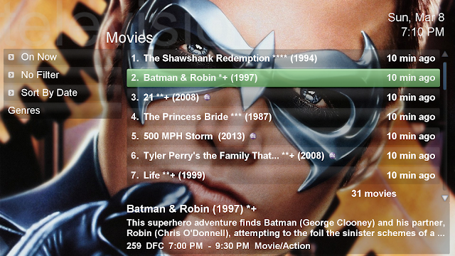
PROS:
- Familiar and most intuitive interface for most.
- Fully customizable.
- Offers a lot of built in features such as upcoming recordings and movies
- Full background fanart
- Extender friendly, however not recommended for the HD100.
- Reliable and does not use a lot of Java resources.
CONS:
- Still based on Version 6 features.
- Old animations and fading for backgrounds
- Responsiveness and lagging are reflective of the Version 6 platform.
- The Videos screen is very lacking and doesn’t run very smoothly.
- Importing and applying plugins are based on old ways and is easier to mess things up.
- No reliable Movie Trailer plugin.
CONCLUSION
So what is my overall synopsis of the UI’s? Well my needs are different than yours and yours are different from others. I think the overall potential for any of them are very good. See, in my household we use 3 extenders and 1 CPU so that can be a bit demanding on the Java resources at 1 gig.
Diamond and Gemstone are the most customizable and if you don’t have a lot of extenders or don’t use extenders, if you like fanart and making your own categories or folders, that may be the way to go. Depending on which one you like better between the two is up to you. Just remember, I did have a little issue with reliability and failed a few recordings because of it.
Believe it or not I still think SageMC is still a very viable option. No it doesn’t have some of the advanced features like movie trailer options that version 7 has, but it is very user friendly. That being said, the Videos menu takes too long to navigate and you cannot customize it. There are different plugins you can install for the video screen, but it doesn’t improve it enough for my tastes and sometimes you lose features like being able to navigate into the folder when you have more than one video in there. While dated looking, I still love this version.
I rank Phoenix 2 just above Phoenix. Reasons are it’s simpler, has the current weather plugin and hides the delete feature for imported videos better. Yes I can work on tweaking Phoenix to avoid deleting a bit better but that’s another thing, It’s a pain to navigate through everything to make changes. For me, the original Phoenix is more attractive, but Phoenix 2 is easier with less that can go wrong.
So what do I end up using the most? That’s right, the original version SageTV version 7, but it’s souped up a bit. I still don’t like the fact that I cannot categorize my movies from everything else without using the plugin Sage My Movies, but I have worked around it creating double folders and have them in the combined format. I like Sage My Movies, but it’s an unfinished product. We can’t see movie trailers of the movie we may be interested in watching like we can outside of the plugin. See this is a big feature for us because my fiancé will want to know what it’s about before watching the movie. Many of my movies I had bought was long before we met. So here is my setup.
- SageTV 7.19 with a customized theme that I have made with the following plugins below.
- Upcoming Movies 2
- Movie trailers
- Movie time
- Phoenix fanart for SageTV (is meant to be a replacement for Phoenix fanart SageTV7 and Phoenix fanart malore menus (it gives full sized background fanart when I hit information)
- CVF-Custom Video Folder
- Movie Showtimes
- Phoenix compatibility features for Default STV
- Playon for SageTV installed but disabled. (this allows for youtube playback but still gives the ability of having Playon in the Online option)
- Restart SageTV
- Experimenting with ADM (another dynamic menu)
For my families needs and the FAC (Fiancé acceptance factor), I have found this setup to give me a little of everything. It is the most dependable version that gives me most of the cool features my family wants with really cool options, a little eye candy for fanart and larger images that doesn’t weight heavy on the Java usage. For the family to accept it, it first must work well and be easy to use. They get this. Yeah, I would love for Gemstone to be easy to use with the weather radar offered in the basic SageTV interface, with the UI functionality of Phoenix with the full fanart that doesn’t drain Java with the user friendly intuitiveness of SageMC that would work seamlessly on the SageTV 7 platform, but that’s just a pipedream for a wonderful SageTV project where development has pretty much ended except for the occasional fix unless something changes drastically in the near future. (Again, nice to know I’m wrong)
Yes, I still dabble from time to time such as making StarWars themes, Tampa Bay sports Themes as well as other personal themes like “Space” and so on, but I haven’t been able to get away from the primary SageTV user theme as of yet. Thanks for all of those who have given us options, it is more appreciated then you’ll ever know. –AND WE CAN’T WAIT TO SEE WHAT YOU’RE GOING TO DO FOR US IN THE FUTURE!!
When it comes down to it, all that matters is what is best for you and your family, please share.
Again, since my writing and the announcement, there has been a BIG BUZZ going on over at SageTV! It seems Jeff Kardatzke has been responding more in the last few days than in the last few years and it seems he may have a bit of a hand helping with things. All kinds of things are being talked about such as backwards compatibility with the older extenders, and the community talking about android versions of SageTV, SageTV apps, apple, extenders, code and so forth. Wow, what a difference just a few days can make.
I can’t wait to see what’s going to happen next.

New life breathed into
New life breathed into SageTV!
Are you sure you don’t mean ‘FAF’?
I’m very much looking forward
I’m very much looking forward to the future to see where things go. It’s great to see folks get excited about it again.
I’m running Phoenix 2 – goes over well with the family and does a nice job with fan art and is snappy interface on my HD300s.