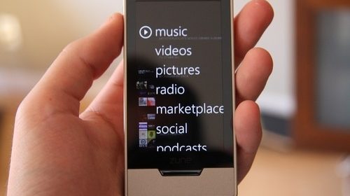
It’s still unclear the precise future of the portable device, but so far reviews are pretty glowing for the new ZuneHD. It looks slick, the interface is good, but I thought the screen was a bit tougher to use than the iPhone given the smaller screen real estate, but it’s so very thin and very drool-worthy.
Gizmodo The gorgeous 3.3-inch capacitive OLED touchscreen takes up the majority of the device’s face. More on that below. It’s surrounded by three hardware buttons: Underneath the screen on the face is the home button, on the top edge is the power/hold button, and in lieu of a volume rocker the Zune HD has a button on the left side that brings up Quickplay options. These options drift onto the screen and offer volume, track forward/back and play/pause. Quickplay can be enabled to work even while the player is locked.
CrunchGear The Zune HD is upon us, and whether you love it or hate it, you have to admit that it is devilishly good-looking. I happen to think it’s also a great media player, based on my day with it and on previous demos, but the final judgment will come in a day or two with the full review. In the meantime, I’m sure a lot of people have been waiting on a decent walkthrough of the Zune HD’s interface. I’ve got just that for you, in HD no less, so click that play button and get an in-depth tour of the music and video navigation, browser, and marketplace.
ArsTechnica Can it succeed? That depends on whether users buy into the Microsoft way of doing things—a way that includes paying for a monthly music subscription. Those who take the bait will find themselves hooked (in both senses) by one of the best portable music discovery experiences yet created. The full subscription experience on the Zune is now unbelievably compelling, offering something that feels like more than the sum of its parts—but consumers have so far shown little interest in subscription music services.

