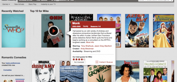
Netflix Optimizes Website for Streaming

I wonder if this is a sign that most Netflix users that are streaming are using devices and not their computers? Or maybe they just really want to remind people that streaming means you can watch it immediately. Some people are up in arms about this new UI, but I’m a fan. There’s no doubt Netflix has invested a lot into their streaming and I have no problems with them wanting to make it as easy as possible to get there.
Starting today, most members who watch instantly will see a new interface that provides more focus on the TV shows & movies streaming from Netflix. The title images are larger, there are more of them on the page and play buttons appear when you hover your mouse over the title images. Star ratings, information and other functions are available when you mouse over the title images. We’ve also made some changes to several pages on the site: adding more rows, and filling out the rows with more TV shows & movies, which you can find by hovering your mouse over the end of a row.

I have a 46in Sharp Aquos TV
I have a 46in Sharp Aquos TV and need advice on a swivel wall mount…any suggestions?
Monoprice is your friend. In
Monoprice is your friend. In both quality and price: http://www.monoprice.com/products/subdepartment.asp?c_id=109&cp_id=10828#1082806
Edit: In particular I would look at http://www.monoprice.com/products/product.asp?c_id=108&cp_id=10828&cs_id=1082806&p_id=3725&seq=1&format=2. It is one of the pricier ones they offer but for a swiveling mount I think it is worth it.
Oh and Mike G is my BFF so
Oh and Mike G is my BFF so hook me up on some good ideas 🙂 thx
lol, i need to teach Nicole
lol, i need to teach Nicole how to create her own forum post 🙂 please excuse her 😛 Hope the answer helps nic, let us know!
I find the new interface
I find the new interface slows me down. I’d often scroll through the front page’s suggestions, quickly rate shows, and add stuff to my queue; now it’s a pain to do that. I suppose if I actually watched streams via that interface, I might like it, but since I only use the main page to find stuff to add, I don’t.
Has the interface become as
Has the interface become as friendly as Instantwatcher.com. Netflix always seems to hide title to get you to watch less popular titles. I always wondered if they paid a premium for newer titles fora period of time.