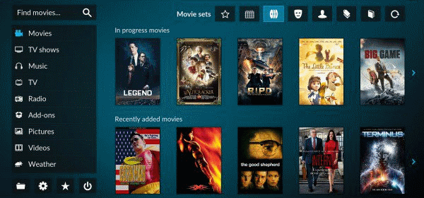
Kodi will get touch friendly “Estuary” skin

As much as I like to look at Confluence, I have to agree that it’s kind of a pain to use on my phone. Now it works, which is why I keep Kodi on my mobile, but it would be great to have something a bit more touch friendly for it, and the slate that has become our “2nd TV”. That’s why it’s great to see the upcoming Estuary skin. It retains much of the visual pop, but uses real estate better and has much larger targets. Looking forward to having a play.
A long, long time ago when Kodi was still called XBMC, a new skin came into life. It was on 21 November 2009 that the switch was made from PM3.HD to Confluence. Over the years it has fulfilled it’s purpose as the default skin which every one sees on a fresh Kodi installation and many likely never switched to one of the other skins available. During this period Confluence received several minor tweaks and updates and only one big change when we switched from a vertical to horizontal main menu.
Today will mark a new milestone in the history of the project as we announce our two new default skins. Yes you read it correct, two new skins. The first one is called Estuary and it will be what most of you will see from now as it is designed for the so-called “10 foot media center experience”. The second one is dedicated to the people who are using touchscreens and is called Estouchy which will be replacing the re-Touched skin.

The Kodi folks have been
The Kodi folks have been jumping versions faster than skin (and addon) developers can keep up with!
Versions 14, 14.1, 14.2, 15, 15.1, 16, 16.1, and now 17 in one year. I love Kodi, but the developers should fix the current version before jumping to the next (ala Intel’s tick-tock).