Showtime Interactive in Vista MCE
|
Showtime Interactive Today we will take a quick peak at the latest online spotlight application in Vista Media Center, Showtime Interactive. Let's see if it's worthy of becoming a player in the online content world. |
Showtime Interactive is yet another online content distributor made possible by the generous folks at Showtime, where you can find and download programs or other Showtime events that you either missed or want a copy of.
I'll be honest, I've never used or reviewed any other type of this application, so I'm a pretty fresh perspective on it, but won't be able to provide a great comparison between say Netflix or Vongo.
I will however, be able to show you–in strong ShadyMG fashion–lots of pictures of basically everything you'd want, and judge how Showtime Interactive stands on its own.
Specifications
I'll begin by giving the high level overview of the requirements and details of the application. I would go over the system requirements, but they're so minimal that if you're running Vista MCE, you should have ZERO problems with Showtime. One item of note, they do recommend 10gb of free space, which is most likely just a safe number, since the files are a healthy size.
As for the file-types, the quality is actually pretty healthy. They come in a variable bit-rate of around 1,200kbps, with resolution of 640×480 pixels for standard videos, and as high as 720×392 for widescreen.
The files are encoded in Windows Media Video format with some lovely DRM tied to it, and appears to vary in file size. As you'll see later, a 2hr 35min boxing event it states is 735mb….where as a show I downloaded, the Chappelle stand-up event, was 58mins but was 592mb. Widescreen formats with the higher resolution do tend to be a little bigger as well, but I don't have exact numbers for you.
Now let's move on to how it works and how well.
Installation & Setup
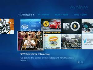
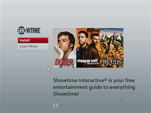
If you're in the United States (sorry Canada & the rest of the world) by now you should have the Showtime Interactive icon in your Online Spotlight explorer. For me, it was a pretty cool image of some show I'd never heard of called "The Tudors." Clicking on it brings up an information screen which is actually done fairly well, which provides some good answers as to how the service works, and of course reminds you it's "free."
|
|
| Online Programs Explorer | Initial Showtime screen |
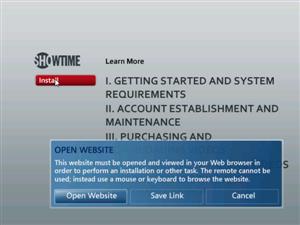
Installation is simple, but I must complain about the lack of true integration with Media Center. In order to install, you need to be at your computer to be able to visit Showtime's website and download the required software.
|
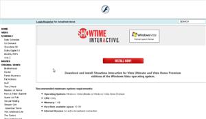 |
| To install you must launch a website outside MCE | At least the website is simple & informative |
|

|
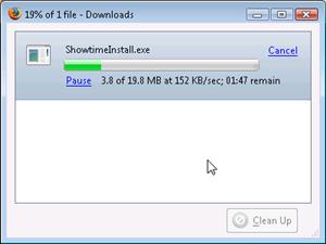
| Almost 20mb of Showtime fun to download | Standard Installation you're used to, how unoriginal |
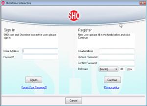
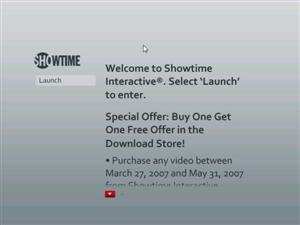
The good part is, that once you have it installed, the Media Center UI automatically updates and you can begin accessing it right away. One part that is annoying is a required registration if you want it installed. I can't stand being forced to register something, and what's even more upsetting is that they require you to put a birthday. I wouldn't mind doing this since I was at my keyboard for the steps, but you'll see in the upcoming screens how it gets very annoying.
|
|
| Required registration to install | MCE screen does update instantly for easy launch |
The installation really isn't nothing to shout to the heavens about. It works just as any standard application works. I would love to see some company adopt a 10' Installation method, especially for an application like this designed at the mass public. But I can't exactly criticize them too much since not many companies have adopted that installation method either.
Usage
I have never used any other content downloader like iTunes or Netflix or Amazon Unbox, so I'm coming at this from a fresh outlook. I'm not sure what I expected at the beginning, but Showtime does a pretty good job of making their interface simple yet extremely informative.
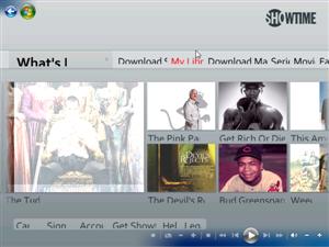
Upon launch the resolution is instantly wrong, but that could be due to the fact that I was in windowed mode. Once I launched full screen the image was perfect (or just resized the window), which is fine as the interface is designed to be used full screen.

|
|
| One moment something…? Please? | You can see the fonts are a little big, but this is fixed when I resize. |
As soon as you launch you can see it's a very attractive interface, but with the Showtime color schema of gray and red, instead of the traditional Media Center colors of blue and green. This didn't bother me as much as I thought it would, as everything looked very clean and functioned as if it were a part of MCE.
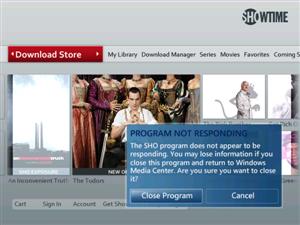
I did encounter a problem immediately when I tried to browse through I suppose too soon. Media Center thought the program had stalled and issued a "Program Not Responding" dialog box, and asking if I want to close it. I gave it a few seconds and it eventually fixed itself, but beware if you have trigger happy family members to be patient with the app if you're on a slower internet connection.
|
|
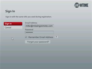
| If you're internet isn't fast and you try to do too much too soon…ERROR. | Sign In screen |
The registration part is extremely annoying as well. As you can see from the screen above, you enter your e-mail and password. Showtime has an on-screen keyboard when you do this to make your life easier, which is great, but they omit a box to "Remember Password." So if you want to download content, you need to Sign In EVERY TIME!! Not only is this annoying, but say you're in your living room with your friends and want to download something, using the on-screen keyboard they'll see exactly what you type. C'mon Showtime, at least give users the option to remember your user information!

|

|
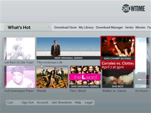
| Showtime Interface – What's Hot | Programming information |
The interface is organized in a horizontal scrolling fashion, with tabs across the top and options at the bottom. Scrolling through is simple, but again takes a little bit longer if you have a slow internet connection.
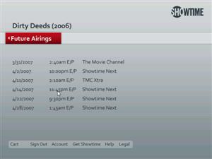
Showtime Interactive is not only designed for downloading exclusive Showtime content, but also for obtaining information about Showtime programming in general. You can learn more about a show or movie airing on Showtime, and get either a full episode guide for a series or see when it airs (assuming you have Showtime through your cable company, otherwise it's just one big tease).

|
 |
| Â | Â |
Hopefully in the future, they won't have to have a separate "Download Store." I can definitely envision a world where you click on a series, read about it, and then are instantly able to download it. 100% On-Demand content! But for a first release, it does a pretty good job of explaining things and making the steps clear.
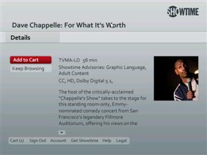
If you want to purchase/watch something, for now, you have to go to the download store. There, they have a multitude of programming, from exclusive Showtime series episodes, to boxing events, to stand up comedy. Basically whatever Showtime has aired in the past they do a good job of making available for purchase (I think, I'm not too familiar with the Showtime programming as I don't have it).

|
|
| One show with time length, price, and download size… | And then another with just the time and nothing else |
Viewing details through the download store is a little less informative than in the other screens, but it does give the information you need…sometimes. What I saw sometimes and expected, was the episode length, price, file size, and rating. For some reason, the Chappelle special was missing most of that information. A minor problem, but still something they should be aware of.

|
|
| View your cart | Remove items with simple one-click X |
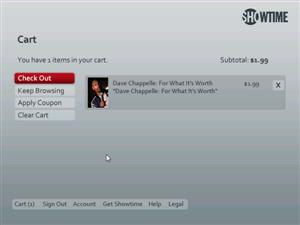
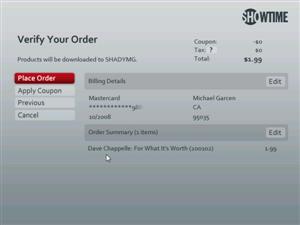
Accessing your shopping cart couldn't be simpler. The layout is clean and the ability to remove is equally effective. It was also fairly easy to enter the billing information as the name & number fields had the same on-screen keyboard as the sign in screen. I was pleasantly surprised that you did not have to enter your entire billing address, as that would have made the experience pretty cumbersome using a remote, so they just ask for the mandatory.

|
|
| Enter credit card information | Verify & complete your purchase |
|
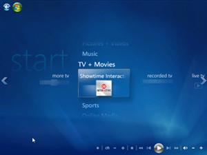 |
| View downloads in progress or completed | Showtime Interactive attached to TV + Movies |
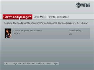
The download starts pretty instantly, and of course download speed depends on the speed of your broadband connection. In my experience, the 600mb file of Dave Chappelle downloaded in about 1.5 hours. Not horrible, but again, if I want to see content, I don't want to have to wait that long. It would have been nice to be able to stream the show once it got a certain percent downloaded.
Overall though, I must admit that using it was much easier than I had anticipated. The program didn't crash once and after the initial launching hiccups, it worked pretty smoothly.
Playback and Extenders
So of course the question on everyone's mind is how's the quality?? While I have limited hardware to test it on, I must say the quality was very good. There was no pixelation on my standard tv and the quality of sound was fantastic as well. The show I got was around 600mb for a 60 minute show, so it better be high quality!
I've got an Xbox360 setup as my Extender, connected to a 50" Wide-screen Sony HDTV (it's the roommate's), and Showtime Interactive looks amazing. It's here that you can truly tell that the interface was designed for 16×9, as it utilizes the space beautifully and is crystal clear. Also, the speed was just as fast through the extender as it was on the actual MCE box.
One thing I wanted to test was streaming to other systems, which unfortunately is not possible due to the DRM built into the program. While Showtime does allow you to backup your download to DVD/CD, it will only playback on that original system it obtained it from. I even tried streaming through Webguide and was denied, which I guess is Showtime's intentions huh.
Luckily I encountered zero problems playing my downloaded content through my extender or the system itself. Since it's a standard WMV file, the Extender can play it without needing to transcode it. Also because of that, you can play the file back either through your Video Library, where you'll just see the file in its folder, with no information other than the filename. Or, you can view the file through Showtime Interactive's interface and then of course see all the program information. I can imagine if you build up a healthy library or have guests, using the interface will be your preferred method so you won't have to describe every show to them.
Conclusion
So how does Showtime Interactive look as a whole in my eyes? Very well actually. They do a good job of showing the power of the new Vista Media Center plugin abilities, making the transitions from MCE to the interface very fast and seamless.
As with all the 3rd party MCE application I've played with, I was disappointed in the conventional installation method which requires users having to go to their systems. Hopefully someone will step up at some point and lead the charge in a seamless 10' installation, but for now, it's hard to criticize Showtime too much for this since they are not alone.
Downloading was fast but still too long for mainstream users to want to wait. They need to incorporate some sort of streaming abilities which would allow people to view much sooner (I'm not sure if other companies do this, but I was somewhat expecting it). People are used to content instantly on-demand, and asking them not only to pay, but to have to wait over an hour, is asking a lot.
Overall, I think Showtime's put forth a great first version of their software. It's sleek, sexy, and extremely useful–if anything more useful as a Showtime programming information guide than as a content downloader. I can definitely see the potential and my only concern is that they do not simply abandon it as happened with MCE 2005 online spotlight applications. Take in the feedback and try to continue to improve your software, and I'm sure you'll be rewarded with more users.
Here are my pros & cons:
- Pros
- Gorgeous Interface
- Easy to use
- On-screen keyboard
- Can backup to CD/DVD
- Works great through Extender
- Good quality
- No time limit
- Cons
- Initial interface hiccups on slower connection
- Can't store password
- No method of changing default video directory
- Can't view on other networked machines
- Registration required to install
- No 10' Installation Method
So, if you watch a lot of Showtime and want more information on a given show or movie, or you just want to download that last ShoBox boxing match you missed, you could do much worse than Showtime interactive. It'll be nice to see all the major players competing with different products like this, and then we can harass Microsoft for a portal of all of them ![]()
If you have other questions feel free to post in our forums, or check out Showtime Interactive's FAQ .
