Hubitat Hub Review- Finally making my automated home automated.
I started out in seeking a “smart” or automated home several years ago. I have owned and or/used several hubs from Wink to Home Assistant. I had settled on Wink for far too long and allowed its shortcomings to maybe make my house “smart” but far from automated. I have a wide range of devices from Nest, Leviton, Jasco, and more. I never really liked the idea of buying a product because it supports a certain hub. I always wanted the hub to support the products I want. This has never been fully achieved and I don’t know that is it ever going to be reached. So much fragmentation in the market really hinders progress. We have owned every smart AI speaker platform Homepod, Google assistants, and Amazon Alexas. It’s a difficult household to meet all the needs and my tech habits don’t help. 😊
A few months ago I ran into Hubitat on a simple web search. I knew nothing of it and had become tired of my patched together smart home working on some devices and not on others. At $100 it was an easy impulse buy category for me and so I bit. I had no idea what awaited, but was it worth all the work to change platforms?
Before I decided to even start looking at alternatives I stepped back and began to viewa automation differently. A hub should just be that a center point, or a server. I want it to have control over everything but it should not be necessary for me to interact with it directly very often. I want to use Apple phones and Google assistant to control it. Another want on the list was Sonos control from touch screens, like Kindle Fires around the house. I got this, and more than I ever imagined.
Hardware
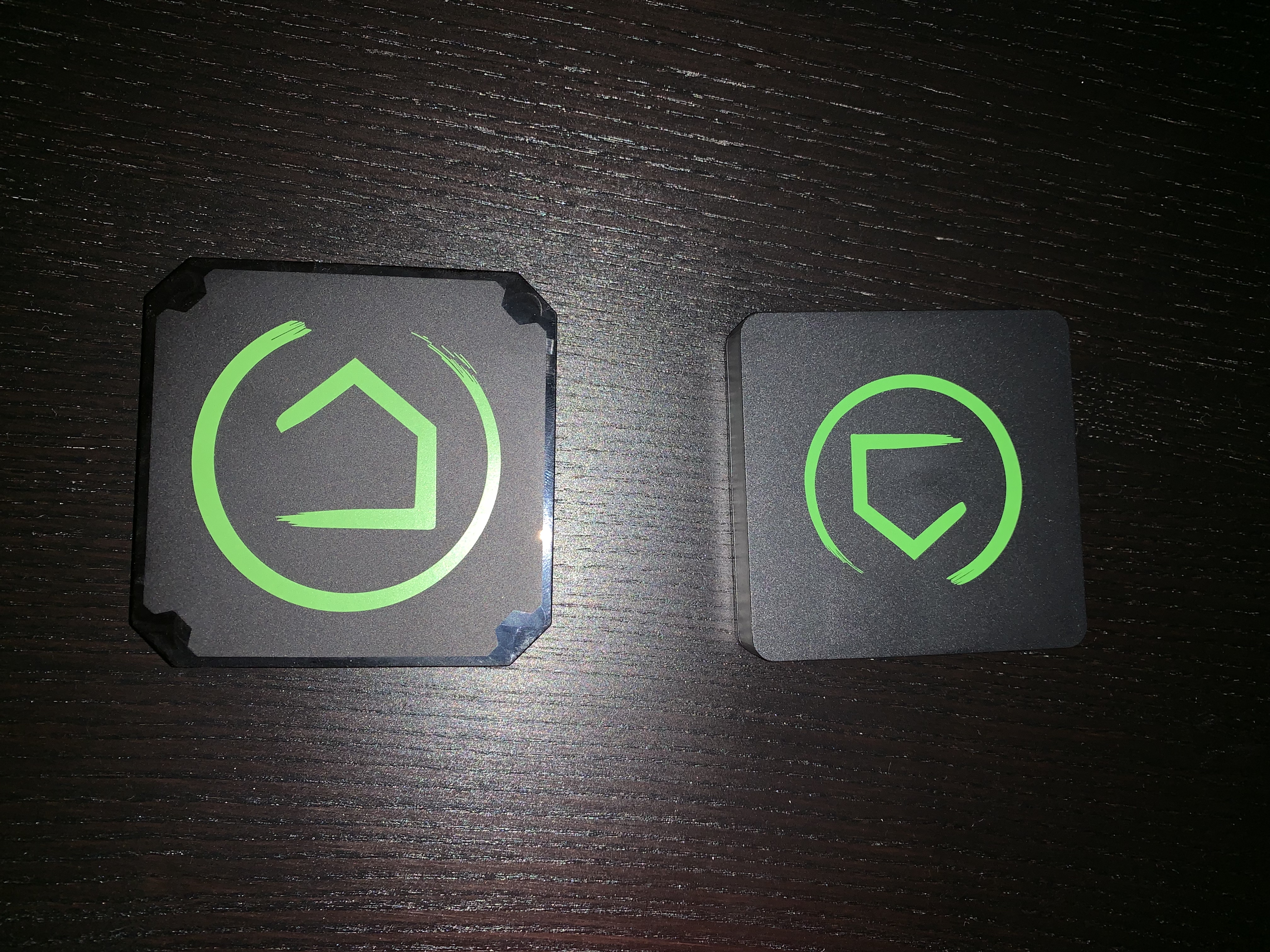
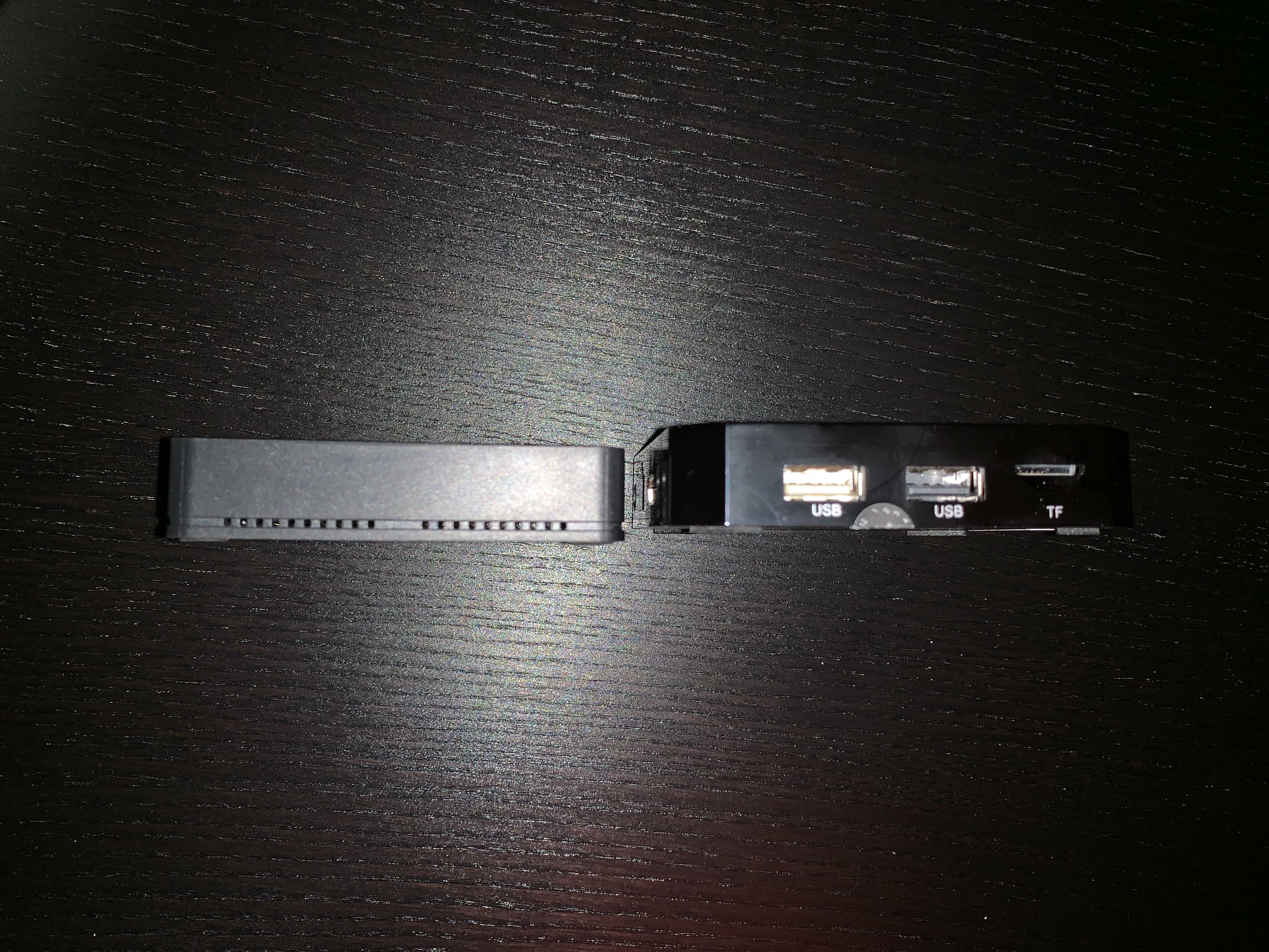
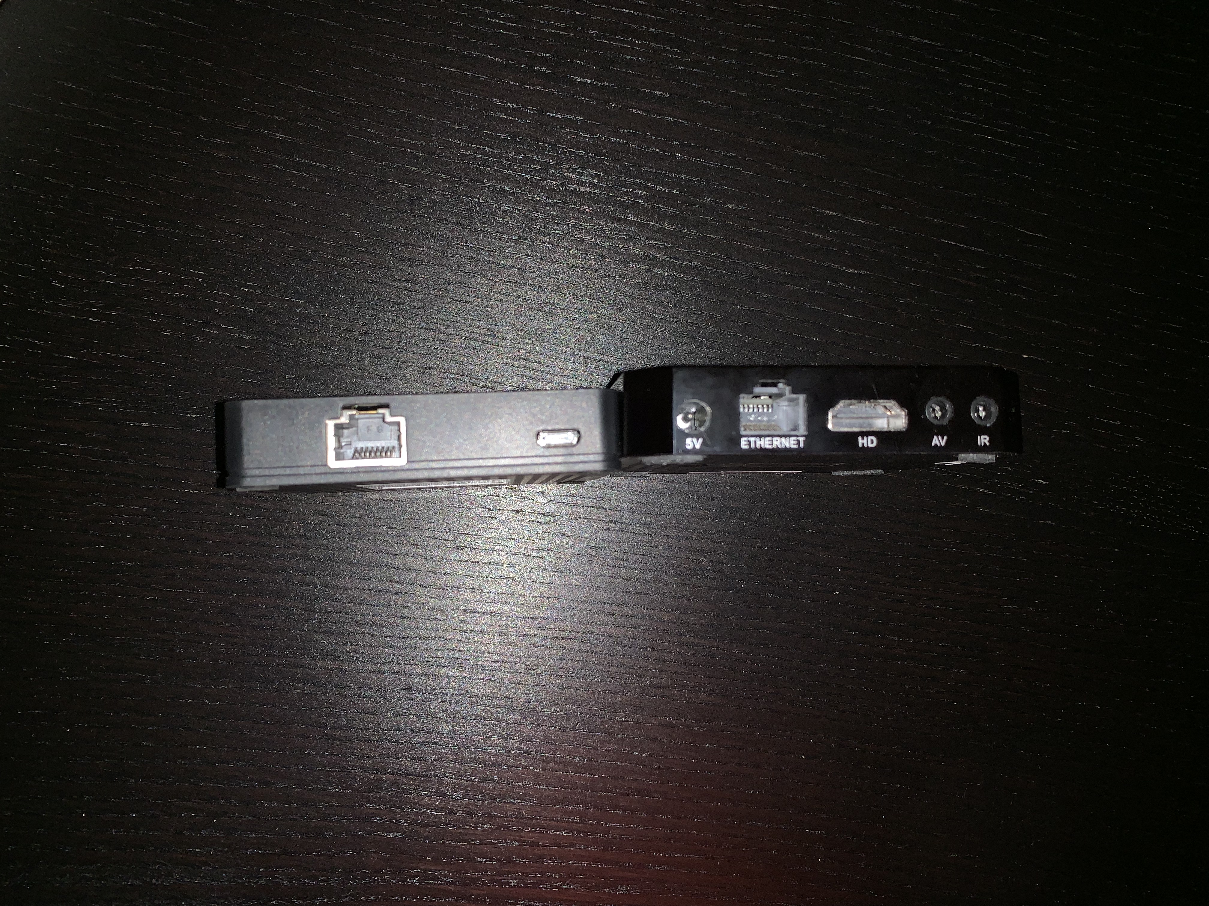
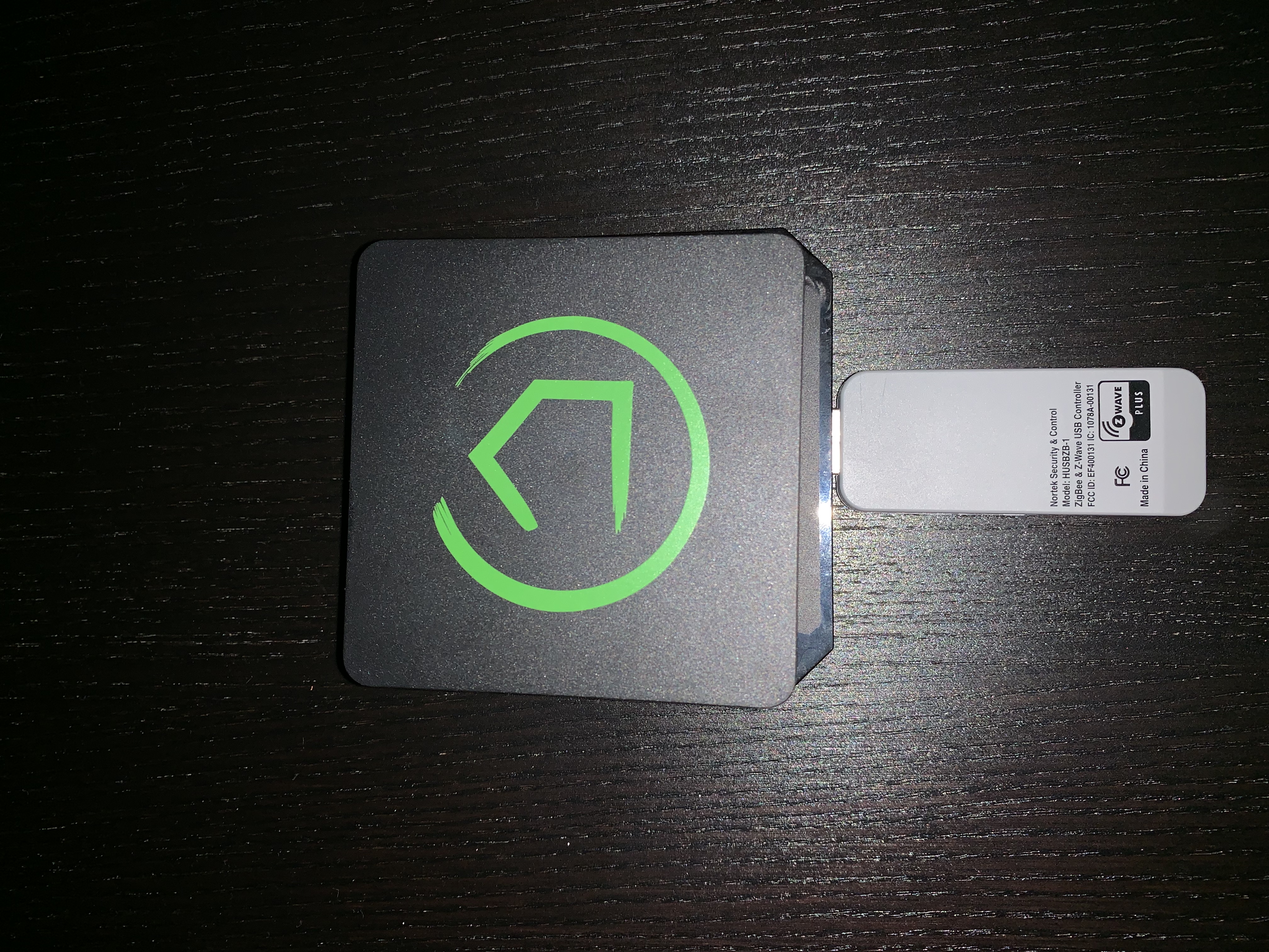
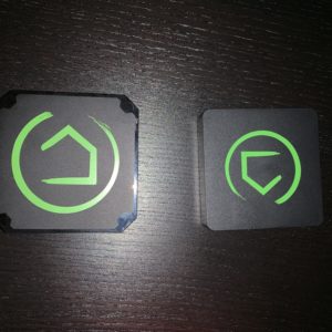
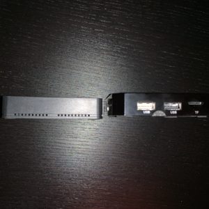
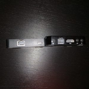
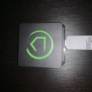
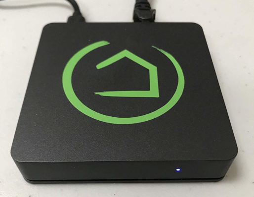
I originally started this journey with a v1 hub purchased myself. After reaching out to Hubitat they provided me a V2 hub for review. Thanks to @Hubitat for this generous offer. Because of this I am lucky enough to compare the 2. The main difference in V1 and V2 is the Z-wave radio is internal in V2 vs an external USB Z-wave adapter in V1. This results in V2 being slightly smaller and definitely smaller after you factor in no USB dongle. Another main difference is V2 is powered by micro USB vs a power barrel on V1. This is a huge difference for those of us, like myself, that want to power the hub via PoE and a welcome addition
I will say the differences don’t stop at looks. V2 Zwave radio is significantly better in my testing than V1. During pairing of my many z-wave devices with V1 hub I had to move the hub around to get closer to devices so they would pair. This was not the case with the V2 hub which I was able to leave on my network rack and pair everything around the house quicker and the first time. This was a huge change in time commitment and usability in my eyes. So definitely can say the V2 hub is a great improvement in my house. There is one nitpick about pairing. Their interface leads to believe multiple devices can be paired at once. I was unable to get this to work with V1 or V2 hub. It required me pairing devices one at a time and going back into pairing screen. I believe this is a software issue not hardware related.
Hardware- 10/10- As of version 2 I have no complaints. I love the move to the internal radio as well as the stronger signal it appears to send. The move to powering over USB is also much appreciated, especially as a PoE user.
Interface
The interface- I will say it, and I expect most will agree, isn’t ideal. This product was clearly made by coders, with maybe not sure much experience in the UX design. Progress has been made with their new Dashboard V2, which finally enables me to make a visually appealing dashboard to operate at my back door.
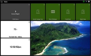
(sorry for picture of the beach we are going on vacation and that’s our motivation image ;))
This allows for the easy control of the comings and goings as we need. Now I will admit the administration interface is a bit rough [Editor’s note: only marginally more so than other DIY home automation products], but again I look at it as more of a server, and it’s far better than a basic CLI interface. I also have faith it will continue to get better (and it has in the latest update many of my complaints were fixed). For me it works, and provides all I need to access. There is definitely a steep learning phase, but it is worth it. Took me a allot of readings on forums and support docs to understand how everything works. They do have a friendly video section that helps with some of the interfaces. The worst part is they just don’t get some basic UX design concepts like backing out of things or erasing settings you already set (Update: This was fixed in the latest update still allows NULLS but they can be removed). The first time you have to remove a rule because you clicked to set a condition you didn’t mean too, you will feel this pain.
New Web Dashboard – 7/10 not great but worlds better than it was. The new custom icons are great but would be better to allow us to even upload our own. Although you can cheat and do it with backgrounds. Also the individual ability to edit each tile vs template would be welcome.
Interface and settings UX – 7/10 and I am being nice because it doesn’t bother me it is rough. Again the point can be made this is a server/hub and not meant to have an attractive interface.
Configuration / Automation – I can start this section with just wow. The options can be overwhelming and hard to understand to grasp the potential at first (see UX). But once you get the groove the trade off in flexibility and capability is massive. The built in app Rule machine can handle incredibility complex tasks. You can have triggered rules, condition rules, and the options are pretty endless when creating them. Here is where the UX limits show most clearly as it relies on some basic coding knowledge, or at least that sort of logical flow. Especially understand the basic If/Then/Else structure. (See here for Oracle example). As I coder I don’t mind the roughness. Because the flexibility more than balances it out. But I can definitely see it turning less experienced users away. It’s not as easy as clicking on icons and linking them in an interface. This product is more for advanced users and/or custom installers. Here is an example of rule I have for leaving our house. It allows my family to open and shut the door as much as they want (within the one minute timer which stops and restarts every time the door reopens and closes). Those that often forget things in the house know how frustrating it can be to have to reset / unset things to go back in. This avoids that, and alone is worth the cost to me! The rule machine is what makes the home automated. Stuff just happens because it’s supposed to; and a lot of it requires little, or no interaction.
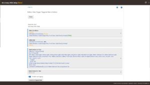
Configuration – 9/10 –I am ignoring the UX in the rating as I really feel the configuration options and rules are some of the best out there.
Support – This is an easy one for me, nothing negative to say. The one negative people may find is there is only email support, but the responses I have had are always fast and very knowledgeable. To me support and standing behind a product is key to my acceptance and Hubitat nails it for me. It’s easy and quick to tell they are strong and passionate about what they do. Drivers are added quickly and response to issues are resolved very quickly in my experience. It can be a bit tricky to find out how to contact them, there is a Support link at the of their forums . This could, and should, be easier to find on their main page for sure.
Support- 9/10 Only because I am docking for no phone support and not advertised strongly enough how to email support.
Community Forums- This is where Hubitat’s support apparatus really starts to shine. The community of users and developers are a strong force at their forums. Most questions or post are answered very quickly,often by Hubitat employees! The company being active in their own community forums is a must and greatly welcome. From the Dev side of things there are tons of guides on how to get started and what Hubitat is capable of. Their forums and activity remind me allot of the old SageTV forums (RIP SageTV), and that is the best compliment I can give them.
Community Forums – 10/10 – Very active and responsive both from users and the company itself.
Development environment – This is one where the possibilities are endless but at times confusing. I will say if you are porting drivers or apps from Samsung Smart Things this is a great forum for easy replace / edit for their code to Hubitat code (Porting forum).Most of it requires simply paste and replace and it will work. Their Developer Documentation can be found here. I will say it’s very lacking and needs updating desperately. I often find API solutions in their forums over that half attempt of a Developer documentation. I wish they would update this more regularly it sure would save time looking around.
They also have a great Maker API which I myself haven’t had time to dig into but hope to soon. It appears pretty capable of creating some dynamic web pages or apps of your own and third party integrations.
It is odd they do all their development right on the apps and drivers editors within the hub. Hubitat claims that is straight where they develop. It does work and well, as it does have checks when you submit but I would prefer an external IDE solution myself. I prefer my own editors over the limits of the web editor.
I have made a couple of drivers myself and it is surprisingly easy once you get the hang of things.
Development environment 7/10 – This does not show how much development can be done with Hubitat because the possibilities are pretty open.That would be a 10/10 for possibilities. The low rating is more for limited docs and no plugin app system or external IDE. I think all the tools are there it just takes digging to find them.
What the future holds – If they can keep the support and community active and hopefully bring in more developers over time the future is bright. IT reminds me of the early SageTV days when people called it “ugly” and shortcoming. SageTV in its final days was anything but that thanks to great third party developers and an amazing company staff and support. I see that same love with Hubitat, their staff and forums. They love what they do and are not showing any signs of stopping progression. They are very open to developers and ideas/suggestions. The easy porting of Samsung SmartThings apps and drivers is just icing on the cake. As for all you old Iris users they have worked hard and diligently to make your port over as easy as possible as well.(Iris Support announced) I think their V2 dashboard is a sign of great things to come. Some Ideas they need and hopefully will add soon that would help the community grow
- An app store
- A driver store
- To go with the above a simple tie in to easy install, previously stated apps and drivers without requiring basic users to copy code into their editor.
- A skin store for their dashboards and a bit more portability to able to share them
- Continued 3rd party support from community.
Personally I am sold and don’t see myself going anywhere else soon. It being local there is no cloud service they can shut down to kill the functions I have. This is my suggested hub and will be for the foreseeable future. If you are considering any hub purchase let this be it!
Pros
- Great small and efficient hardware
- Rule engine is one of, if not the best I have used
- Third party / developer support is top notch
- Capabilities for HA lovers and constant tinkers is unmatched
- Constant updates and drivers added
- Dedication and commitment of Hubitat staff
Cons
- There is a steep learning curve with the UI and Rules.
- Definitely not for the plug it in and it works crowd.
- No app store or easy plugin system requiring standard users to copy and paste code into interface

